


Meet to
Meet
Mobile Case Study Coming Soon

I'm a UX/UI Designer who's up for a challenge! Whether it's problem-solving or creating a masterpiece, let's work together to design something great!
Hi, my name is

Lets Connect &
Talk Design!
Get in touch with me to discuss your project or ask any questions. I would love to hear from you!

Meet To Meet
Deep Connections, Real Encounters
November 2023
November 2023
Meet to
Meet
Deep Connections,
Real Encounters
November 2023
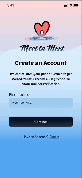
Meet to Meet is a dating app that takes the pressure off by connecting users through singles events, not just profiles. Instead of swiping on individuals, users swipe through events and purchase tickets to attend. This reduces the stress and uncertainty felt with traditional dating apps and creates a more relaxed way to meet people.
Overview
Meet to Meet is a dating app that takes the pressure off by connecting users through singles events, not just profiles. Instead of swiping on individuals, users swipe through events and purchase tickets to attend. Everyone attending an event can then talk online and get to know each other before the event. This approach helps reduce the stress and uncertainty felt with traditional dating apps and creates a more relaxed way to meet people.
THE TEAM:
4 UX/UI Designers
MY ROLE:
Researcher and Designer
DURATION:
3 Weeks
TOOLS:
Figma, Miro, Google Drive
Key Impacts
1
Provides users with an innovative and enhanced dating experience.
2
Minimizes stress and alleviates anxiety in the dating process.
3
Numerous revenue streams generated from businesses showcasing their events.
4
Boosts ticket sales and customer engagement for vendors.

Dating apps themselves have features that can reduce anxiety, and since it's a platform that users are already familiar with, we decided to use that as the foundation for our solution. To counter This resulted in us creating an app that retains features that decrease anxiety and eliminates the ones that increase it! it all up in an app. This lead us to wanted to thought that we could since a lot of people use dating apps, maybe we could create an appby creating our own dating app?
This is where our team decided to brainstorm ways we could help ease dating anxiety for people like Bobby. Since dating apps already offer some features that can reduce anxiety, we decided to use that as the foundation for our solution. By combining the best aspects of online and offline dating, we created an app that keeps features designed to ease anxiety while eliminating those that contribute to it. The result is a dating app designed to make connections feel more natural and less overwhelming
This is where our team decided to brainstorm ways we could help ease dating anxiety for people like Bobby. Since dating apps already offer some features that can reduce anxiety, decided to use that as the foundation for our solution. Then we focused on combining the positive aspects of online and offline dating in a way that reduces stress and uncertainty, paving the way for more comfortable and natural connections.
+
Meet Bobby
Our first step was creating a user persona, our app's ideal user who represents all the people involved in our research. Her name is Bobby Love. Over the past few years she's tried using numerous dating apps and even attended in person singles events. While she found some features of these apps great and the singles meetups interesting, there was always something that made dating difficult.


Bobby Love
Age: 29
Occupation: Tech Support
Location: Canada
Who am I?
I'm Bobby! I work in tech, I love contemporary dance, and I have an iguana named Iggy!
My Pain Points
I'm nervous to ask people out in person and I find it hard to connect with people online!
My Goals
I want to find someone to share my life with and learn more about myself!
My Behaviours
I use my phone a lot, I've tried dating apps, but haven't had much luck...

Bumble
Found the swipe functionality and women-first messaging great.

BUT
It's hard to ask people out on dates and form connections...
My Dating Experience
Toronto Dating Hub
It's limited to Toronto, and I felt anxious talking to people I haven't met...
BUT
Has fun events with themed activities for singles.

Liked swiping feature
and online chat
feature.
Tinder

Users focus on looks and casual relationships rather than long term...
BUT
Brainstorming
This is where our team brainstormed ways we could lower uncertainty to help people like Bobby ease their dating anxiety. We decided that combining aspects of online and offline dating that reduce uncertainty and anxiety, and eliminating aspects that increase them would be a possible solution. Below is a summary of the good and the bad in online vs offline dating:

Bobby Love
Age: 29
Occupation: Tech Support
Location: Canada
Who am I?
I'm Bobby! I work in tech, I love contemporary dance, and I have an iguana named Iggy!
My Behaviours
I use my phone a lot, I've tried dating apps, but haven't had much luck...
My Goals
I want to find someone to share my life with and learn more about myself!
My Pain Points
I'm nervous to ask people out in person and I find it hard to connect with people online!
Dating apps already have features that can reduce anxiety, and since it's a platform that users are familiar with, we decided to still use that as the foundation for our solution. We then realized that we could still use the idea of swiping on experiences instead of profiles. It's a way to incorporate in person dating onto a dating app. Having users buy tickets for singles events so they can meet in person also solves numerous pain points users described during our interviews.
-
-
Less pressure than talking in person
-
Prompts help start conversations
-
You can filter profiles to increase compatibility
Hard to match with people
Worried accounts could be fake
Online conversations are not as authentic as in person
Online Dating
Users know the person is real
Visual and social cues make it easier to communicate
Interaction feels more natural
Asking others out leads to anxiety
Hard to find people to date
Fear of approaching them at the wrong time or place
Offline Dating
+
-
-
Less pressure than talking in person
-
Prompts help start conversations
-
You can filter profiles to increase compatibility
-
Hard to match with people
-
Worried accounts could be fake
-
Online conversations are not as authentic as in person
Online Dating
-
Users know the person is real
-
Visual and social cues make it easier to communicate
-
Interaction feels more natural
-
Asking others out leads to anxiety
-
Hard to find people to date
-
Fear of approaching them at the wrong time or place
Offline Dating
+
Pain Point
Solution
Uncertainty when making the first move
Buying a singles event ticket removes the pressure and uncertainty of initiating
Uncertain whether they'll be safe on an in person date
Verified public events ensure a secure dating experience
Uncertain of what topics the other person wants to talk about in person
Profiles display attendees’ interests, and users can talk online before events
Uncertain whether online profiles are real or genuine people
In-person events and phone number verification confirm attendees are real
Uncertain whether they'll get matches on a dating app or if it will waste their time
Swiping on events instead and meeting in person eliminate these uncertainties
A New Path to Connection
Our solution is Meet to Meet. It's a dating app designed to reduce uncertainty by combining the aspects of online dating and offline dating that provide certainty. Instead of uncertainty and fear stopping you from asking someone out, you can simply buy a ticket to a singles night event, the first step is done for you. Instead of feeling uncertain about whether someone wants to be approached, you'll know the environment is appropriate. With built-in security, you can also be sure you’re meeting real people, no more worrying about scammers or fake profiles.
Overall, this app makes dating simpler, safer, and more comfortable. By decreasing uncertainty, it helps users make real connections, all while staying true to their dating goals and desire for meaningful relationships. But how did we design this solution?
The Real Fears Behind Dating
Dating, it goes hand in hand with uncertainty. Whether we're approaching someone in person or through an app, that uncertainty can lead to feelings of fear, which can make it hard for people to make the first move or take the next step.
Though common, this problem wasn't initially on our radar. We thought that people might find dating apps superficial, and that we could help by creating an app where you swipe on experiences instead of profiles. To see if this was a real problem we conducted interviews and created a survey to get a deeper understanding of what people think about dating and what kind of feelings these thoughts evoke. What we discovered during this stage is that people have different concerns than we thought...
?
What if they're not like their profile?
?
?
What if they say no?

?

?
Thoughts
?

?
?

?

?
Should I approach them?
?
Are they even a real person??
?
?

?

?
?
?

?
Is this the right time?
?
?
?
?
?
Thoughts
?
?
?
?
?
?
?
?
?
?
?
?
?


Feels anxious sharing things and asking people out

Why?

They afraid of feeling rejected
after being vulnerable.


Would feel guilty if they made anyone feel uncomfortable

Why?

They value
kindness, respect, and being mindful of others


Afraid they'll put in time and effort and still not find anyone

Why?

They value their
time and energy
and don't want
to "waste" it


Dates because they desire having a lifelong connection

Why?

They don't want to feel lonely, and want to live a fulfilling life

Emotions and Motivations
Pain points
Approaching people is daunting
I want to feel safe when going out on dates
I don't know when to approach soomeone
I barely get any matches on dating apps
We realized that our initial hypothesis wasn't accurate, so we shifted our focus onto the insights we were presented with. We noticed that there is a lot of anxiety and fear when it comes to dating and that these feelings make dating difficult.
The thing is, we also discovered that people have an innate desire for connection and relationships. Our interviews revealed it's a fundamental goal for many, but that these feelings act as direct obstacles for people trying to achieve this important goal.
When we asked what people find challenging when it comes to online and offline dating, and we were met with numerous pain points:
We then looked for the root cause of these thoughts, emotions, and pain points, if there was a common factor throughout our research, and there was:
Uncertainty
We realized that they ultimately stem from uncertainty. Not knowing how other people feel, the authenticity of profiles on dating apps, whether using dating apps will waste their time. Uncertainty leads to worrying thoughts and negative emotions that make dating a challenge.
It prevents people from taking action and achieving their deep rooted goal of finding a life partner. But what if dating didn’t have to be filled with so much uncertainty? As a team, we thought to ourselves...
How might we reduce uncertainty for people when dating so that they can foster the connections they desire?
Pain Point
Solution
Uncertainty when making the first move
Buying a singles event ticket removes the pressure and uncertainty of initiating
Uncertain whether they'll be safe on an in person date
Verified public events ensure a secure dating experience
Uncertain whether online profiles are real or genuine people
Profiles display attendees’ interests, and users can talk online before events
Uncertain of what topics the other person wants to talk about in person
In-person events and phone number verification confirm attendees are real
Uncertain whether they'll get matches on a dating app or if it will waste their time
Swiping on events instead and meeting in person eliminate these uncertainties
App Features
As you can see below, we decided which additional features to include based on how impactful they'd be for users, and how easy they would be to execute.
High
Complexity
Low Impact
Don't Do
App for vendors to sign up and add events
No profile pictures, only avatars
Do Next
Premium
plan feature
Block
list feature
User photo verification
Do Later
Tips and suggestions before ticket purchase
Do Now!
Swiping left
or right on experiences
Group chat opens before
events
Phone
number verification
Event filters
Ex. price range
High Impact
Low
Complexity


High
Complexity
Low Impact
Don't Do
App for vendors to sign up and add events
No profile pictures, only avatars
Do Next
Premium
plan feature
Block
list feature
User photo verification
Do Later
Tips and suggestions before ticket purchase
Do Now!
Swiping left
or right on experiences
Group chat opens before
events
Phone
number verification
Event filters
Example:
price range
High Impact
Low
Complexity

User Flow
From there we designed the the user flow, and began working on a prototype! Hover over the image below to zoom in!

Prototype Creation
Everyone on our team sketched out potential screens for the app. Then from all of our sketches we picked which features we wanted to keep and combined them to form wireframes!
Sketches
Hover your mouse over the screens to see wireframes for these sketches


Tap on the screens below to see wireframes for these sketches
Onboarding Wireframes

Home screen Wireframes

Logo
Typography
Style
Inspiring
Light
Playful
Comforting
Colour Palette
Accessibility


Low to High Fidelity-Prototype
When designing this app, we used a style guide to organize our visual choices. Our goal was to select fonts and colours that gave the app a playful and light feel. Once the style guide was established, we applied it to our wireframes! Many screens needed to be designed, so one group member and I split the work. I focused on the onboarding process, while they designed the home screen. Below, you can see our initial style guide and the first version of the app’s screens.
Style Guide

Low-Fidelity Screens


Feels anxious sharing things and asking people out

User Testing
We had 5 users attempt different tasks using our prototype, and we made the following improvements based on feedback and how users interacted with the prototype
Problem #1
20% of users used the tutorial, many were confused when they tried completing tasks.

Solution #1
After implementing a tutorial that couldn’t be skipped, 100% of users understood app functions


Problem #2
The add to cart icon on the event card blended in with background and was hard to see.


Solution #2
White background added to improve visibility. Made "cart" a ticket icon to differentiate it from the add to cart icon.


Problem #3
20% of users successfully purchased event tickets on the app. The ticket icon was not a good indicator of where to go to checkout.

Solution #3
After changing icons to carts, adding labels, and an "add to cart" animation user success rate increased to 100%


AB Testing
To make improvements, we also presented users with two versions of designs from the app and had them pick which one they preferred and tell us why.
Menu
Users felt like the menu was easier to understand with labels. They liked that they didn't have to assume what the icons meant
A

or
B

Onboarding Questions
Users agreed that questions like "where were you born" could be removed from the profile creation stage to make the process quicker
A
Include

or
B
Remove
Message Tab Header
We asked users if they preferred a different header for the messages tab. However, everyone said they liked messages!
A

or
B

Onboarding Question Order
Users also preferred being asked about their interests early on, since it makes them feel they like the app's focus is on the user and their interests rather than other people on the app.

Scroll to See Full Diagram
Why Testing Matters
Testing is important for improving the user's experience, but it's also important for the business! Identifying areas for improvement and making adjustments will actually boost metrics and help a business succeed. Below are examples of how the improvements we made during testing this project would affect the user and Meet to Meet's growth.
Increases conversion rate and customer loyalty
Reduces customer support inquiries
Increases customer satisfaction and engagement
Gives users a
personalized
experience
Minimizes confusion
and maximizes
ease
Creates a smooth
and intuitive
experience
Improvement
Affect on User
Affect on Metrics
Using profile
questions that feel relevant to users
Creating an easy to follow tutorial
Making the checkout process easy for users
Affect on Business
Increases Revenue
Saves Money
Good Reputation
Scroll to See Full Diagram
For the onboarding screens, the first two were the splash screen and the login/sign-up screen. These were important because they showcased the logo and app title, which we wanted to finalize as a team. I created different versions of the logo and title, and together, we worked through iterations until we came to an agreement. Below, you can see how the design evolved. Accessibility was also a key consideration, and we made adjustments accordingly.
Logo
Typography

Accessibility
Our next step was to figure out how to make the app functional and add animations. Since our app involved a swiping mechanism for cards, my teammate worked on implementing that interaction. We collaborated to refine it and added additional animations, such as cards flashing when a card was hearted. This was a valuable learning experience, and I was quite surprised by the complexity behind making the swiping mechanism work.
Card Swiping Components

Design Choices
On my end, I focused on creating a seamless onboarding process, designing transitions between screens, and ensuring an intuitive yet visually appealing user experience. Below, I’ve included the design choices my team and I made, along with the reasoning behind them.


We decided to create an animation for our logo to draw in users. With my team's input and ideas, I created an animation we all liked and agreed upon.

I designed an easy way to transition between the sign-in and sign-up screen to make experience simple for users. I also made sure users could differentiate between the screens to minimize confusion

I created an animation to give users a delightful experience when they upload their photo

We included inclusive options for gender and who the user is interested in, and provided multiple answers so they can create a profile that represents them most accurately

I included a progress bar to provide users with a visual of how far along they are in the profile creation process. This has been shown to reduce anxiety and increase satisfaction for users.
Examples Using Components
Through this project, I gained hands-on experience with using components, and created screen transitions, drop down menus, tutorials, button states, and "add to cart" animations. I also learned from my team about designing menus and icons.


Scroll to See All Sceens
Scroll to See All Sceens
Sign in Screen Fidelity Journey
A display of how our sign-in screen transitioned from sketches to high-fidelity prototypes.

Sketches

Wireframe

Low-Fidelity

Mid-Fidelity

High-Fidelity
Home Screen Fidelity Journey
Scroll to See All Sceens
Scroll to See All Sceens
Iteration played a key role in our design process, but user feedback was just as important when making design decisions. By testing our prototype with real users, we ensured that the app was intuitive and easy to use. This helped us create a better final product!

Sketches

Wireframe

Low-Fidelity

Mid-Fidelity

High-Fidelity
Final Thoughts
What Did We Learn?
How to collaborate and come to agreements on ideas

How to move forward even if something isn't perfect

Done is
better than perfect

How much work we were able to accomplish in
3 weeks!

I'm a UX/UI Designer who's up for a challenge! Whether it's problem-solving or creating a masterpiece, let's work together to design something great!
Hi, my name is
Meet
Click below to view the final prototype and slide deck for this project!
Meet to Meet
High Fidelity Prototype
Click below to view the final prototype and slide deck for this project!
Our Next Steps
Enhance user safety by adding email verification
and photo verification

Create a marketplace for vendors to create and list events

Iterate the app further using user testing feedback

High-Fidelity Prototype
Click below to view the final prototype and slide deck for this project!


Click mockup to start prototype

Click image to view slide deck
Click image to view slide deck
High-Fidelity Prototype
Click below to view the final prototype and slide deck for this project!

Meet to Meet
Deep connections, real encounters
November 2023

Case Study Under Construction
Click mockup to start prototype
Click image to view slide deck
Meet To Meet
Deep Connections, Real Encounters
November 2023
November 2023
Meet to Meet
Meet
Deep Connections, Real Encounters
November 2023
The Real Fears Behind Dating
Dating, it goes hand in hand with uncertainty. Whether we're approaching someone in person or through an app, that uncertainty can lead to feelings of fear, which can make it hard for people to make the first move or take the next step.
Though common, this problem wasn't initially on our radar. We thought that people might find dating apps superficial, and that we could help by creating an app where you swipe on experiences instead of profiles. To see if this was a real problem we conducted interviews and created a survey to get a deeper understanding of what people think about dating and what kind of feelings these thoughts evoke. What we discovered during this stage is that people have different concerns than we thought...
?
What if they're not like their profile?
?
?
?
?
?
?
Is this the right time?
?
What if they say no?
?
?

Thoughts


?
?
?
?
Should I approach them?
?


?
Are they even a real person??
?
?
Emotions and Motivations
Feels anxious sharing things and asking people out
Why?
They afraid of feeling rejected
after being vulnerable.
Would feel guilty if they made anyone feel uncomfortable
Why?
They value
kindness, respect, and being mindful of others
Afraid they'll put in time and effort and still not find anyone
Why?
They value their
time and energy
and don't want
to "waste" it
Dates because they desire having a lifelong connection
Why?
They don't want to feel lonely, and want to live a fulfilling life
We realized that our initial hypothesis wasn't accurate, so we shifted our focus onto the insights we were presented with. We noticed that there is a lot of anxiety and fear when it comes to dating and that these feelings make dating difficult.
The thing is, we also discovered that people have an innate desire for connection and relationships. Our interviews revealed it's a fundamental goal for many, but that these feelings act as direct obstacles for people trying to achieve this important goal.
When we asked what people find challenging when it comes to online and offline dating, and we were met with numerous pain points:
Pain points
I don't know when to approach soomeone
Approaching people is daunting
I barely get any matches on dating apps
I want to feel safe when going out on dates
We then looked for the root cause of these thoughts, emotions, and pain points, if there was a common factor throughout our research, and there was:
Uncertainty
We realized that they ultimately stem from uncertainty. Not knowing how other people feel, the authenticity of profiles on dating apps, whether using dating apps will waste their time. Uncertainty leads to worrying thoughts and negative emotions that make dating a challenge.
It prevents people from taking action and achieving their deep rooted goal of finding a life partner. But what if dating didn’t have to be filled with so much uncertainty? As a team, we thought to ourselves...
How might we reduce uncertainty for people when dating so that they can foster the connections they desire?
Low to High Fidelity-Prototype
When designing this app, we used a style guide to help us organize our visual choices. We wanted to use fonts and colours that give our app a playful and light feel. Below you can see our initial style guide.
Logo
Typography
Style
Inspiring
Light
Playful
Comforting
Colour Palette
Accessibility
Feels anxious sharing things and asking people out
User Testing
We had 5 users attempt different tasks using our prototype, and we made the following improvements based on feedback and how users interacted with the prototype
Problem #1
20% of users used the tutorial, many were confused when they tried completing tasks.
Solution #1
After implementing a tutorial that couldn’t be skipped, 100% of users understood app functions

Problem #2
The add to cart icon on the event card blended in with background and was hard to see.

Solution #2
White background added to improve visibility. Made "cart" a ticket icon to differentiate it from the add to cart icon.
Problem #3
20% of users successfully purchased event tickets on the app. The ticket icon was not a good indicator of where to go to checkout.
Solution #3
After changing icons to carts, adding labels, and an "add to cart" animation user success rate increased to 100%